Posted on Leave a comment

Christmas Handmade Market

This weekend was our first 3 day show ever. And we’re very happy we decided to go to the Handmade Market at Honsberger Estate winery with over 80 other artisans.

The organization by Mark, Jennifer and their team was amazing. And our host winery was the perfect setting. Featuring the Sip and Savour Barn, a great outdoor wood burning pizza oven, the heated patio and fire pit seating to keep folks warm and cozy – all allowed for a huge number of people to move around easily, eat, drink, shop and enjoy the day.

A big thanks to all who organized and worked behind the scenes.

And of course a very big thanks to all who made it out and supported us and all the local artisans.


HandMadeMArket


The Handmade Market is an artisan market experience featuring products created and promoted by local artisans as well as delectable food and wine. The HandMade Market seeks to promotes the arts and offer a local shopping alternative in an upscale atmosphere.

In a world where every dollar you spend could be a vote in favour of local business and against the oppression of workers in developing nations, the HandMade Market offers you an important opportunity to shop with a clear conscience and support local business and the arts at the same time! No homogenous, androgynous, thoughtless, big-box items here!

Posted on Leave a comment

POME PLAYSHOP: Postcards on the Showcard

We’ve been thinking about hosting letterpress workshops for a while now. So many of you are curious about learning more about letterpress printing, so why not come to our studio for a letterpress workshop? But doesn’t a workshop sound like we’re going to put you to work? We think learning about letterpress and tinkering with type should be fun. And that’s why we decided to host Pome Playshops instead. We’re kicking off our series with:

“Note cards on the Showcard”

In this 3-hour introduction to letterpress playshop you’ll design and print a note card with matching envelope on the Showcard Mini proof press. We’ll start by learning a little bit about the letterpress process and then dive right in to designing your cards using vintage wood and metal type, cuts and illustrations. At the end of it you’ll take home 10 note cards with matching envelopes to send to all your friends. Put them in a cool frame and you’ll have your very own original art print! (If you do that, don’t forget to sign and number them for when you become a famous artist.)


QUAD-image-900x672


DATES:

To be announced. Send us a note if you’re interested, and you’ll be the first to know when we announce the next dates.


COST:

$125 + HST per person, limited to 2 participants per workshop. All supplies are included.


LOCATION:

Oakville, Ontario just off the Third Line exit of the QEW/403. If you’re taking the GO Train, we can make arrangements to pick you up from Bronte station.


HOW TO REGISTER:

Send an email to inkyhands[at]pomegranateletterpress.com to let us know which class you would like to take. After you receive confirmation from us, we will bill you via paypal and send you directions to our studio.


Other Playshops we offer

Real typesetting with real type
Lino carving and print-making
Street life poster
Word cloud posters

Or better yet, do you have an idea for a playshop? Send us an email and we’ll talk.


main-blogshot-900x509


Posted on

SHOP LOCAL VIA THE WORLD WIDE WEB

The web is a wonderful thing. It means we can connect with people from all over the world and produce work for clients as far away as Scotland (Hi Terrence!). What we miss when working long distance is the personal connection, the human touch and the building of strong relationships through mutual respect and support.

Jay Perry is a photographer from Stoney Creek, just outside of Hamilton, Ontario. He believes in supporting local artists, tradespeople and community. (Take a look at his side project Friends with Hearts to see how a few people can change the lives of many in their own community). When he decided it was time to bring his letterpress printing north of the border and work with a local company, he found us on the world wide web, and sent us a note.

His request was simple. He wanted one-colour note cards with his logo. That’s it, that’s all. Now normally we’re not a trade printer because of our kooky schedules and our love of the design portion of the process, but much like Jay, we try to support and shop local as much as we can. And look how good his logo looks on scrumptious Crane’s Lettra. A match made in heaven.

Thanks to the world wide web, we’ve made another great, local connection. If your match made in heaven is looking for a wedding photographer, check out his amazing work at Hilmer & Himson (the adorable pups in his logo).

shadow-shot


Posted on Leave a comment

A SIMPLE DECLARATION OF LOVE

Not into schmaltzy, gooey, sickly sweet Valentine Day cards? Are you a person of few words? Here are the cards for you. A simple declaration of how you feel, with nary a speck of red or pink in sight. All cards are hand-set using metal type and hand-printed in very limited quantities. Cards are 4.25″x4.25″, blank inside and printed on pure-as-the driven-snow white Strathmore. Available now in our store.


Maybe you’re a little shy and want to express your sentiment quietly with 12pt Century Schoolbook.

schoolbook2_900x516

Or, you’re sure of yourself and want to make a simple, bold statement in 24pt Univers Bold

helvetica-900x675

For those with a little flair and confidence, how about 36pt Huxley Vertical?

huxley_900x842


Posted on

LET ME COUNT THE WAYS…

People often compile lists as a way to remember the past year and to highlight special moments. Tanya created a special list and contacted us just before Christmas to help her create the perfect gift for her husband. They were coming up on their first year anniversary and she wanted something that was one-of-a-kind, personal, meaningful and reflected how much she loved her husband.

The traditional gift for a first year wedding anniversary is paper. Tanya’s idea was to create a custom designed and printed poster to celebrate 52 Ways she loved her husband – one for every week of their marriage. Lucky for us she decided on letterpress and found us online.

We are so thrilled and honoured to be part of this very touching project. Helping her create her own piece of art is very rewarding for us. And we hope she and her husband enjoy compiling a new list for the years to come. Thanks, Tanya for the picture of the framed piece and so glad to hear your husband loved it.

Who says romance or print is dead?

52waysframe_900x1426

52ways_900x986

Posted on

SOMETIMES YOU JUST GOTTA DESIGN FOR FUN

A few years back I came across this really cool Design Competition. For what ever reason life got in the way of design. That and the fact that we’re starting the Letterpress thing. I can’t complain too much, I was able to get my “design rocks off ” in other ways. But this year when the email came about submitting, I just decided to do it.

And so I did. The process started by researching what Francisco Mantecon Poster Design Competition was all about. Then a little research on the winery itself. To me part of the interest was the location of Vigo and the Winery. I’m not Spanish, but my family roots do come from northern Portugal and the Porto region. Vigo is also one of the largest fishing ports in the world which I didn’t know before this. So it was all coming together in my mind. And with a little bit of time in there, the ideas started to mix around. With some sketching the ideas then started to come out.

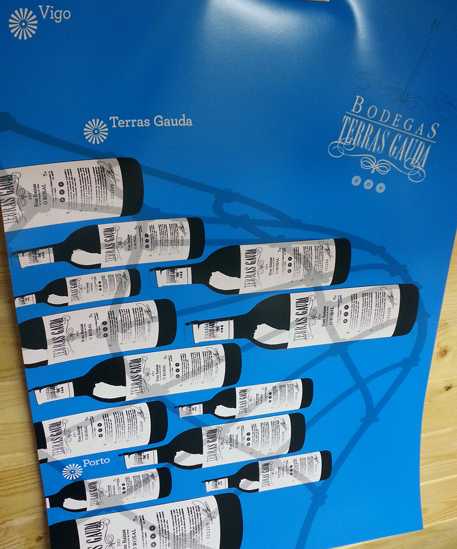
My concept was to create a map of the Vigo region and northern Portugal. While connecting the winery to Vigo’s main industry – the fisheries. As well as incorporating the Terras Gauda logo creatively.

The entire poster is a conceptual map – although subtle. At first glance the bottles of wine are just fish being caught in a net. But look a little closer and you’ll find that the netting is the shape of the Portuguese/Spanish border. The logo is the compass. And the three locations on the map are Vigo, Terras Gauda and of course Porto, which tie back to the three flourish icons in the logo.

I designed something that is relevant, impactful, simple and creative. And that to me is what the design process should be about. Too often we just rush around executing designs, instead of creating design – and having fun along the way.

This was also a chance to please no one but myself. A piece of design and art that meets the contest brief, or at least my interpretation of it.

Yesterday, I received this email:

—————————————————————————————–

Hello,

We inform you that your  poster will be part of the exhibition of the 11th International Poster Design Competition Francisco Mantecon at Estación Marítima in Vigo (Galicia, Spain).

The jury meeting will take place on Friday, November 29th. We will contact all finalists the first week on December.

The jury’s decision will be announced on Friday, December 13, during the ceremony the awards.

Thank you very much for your participation.

Best regards,

Mª José
Dpt. Communication
Bodegas TERRAS GAUDA

—————————————————————————————–


Thank you to Bodegas Terras Gauda and the 11th Francisco Mantecon International Poster Design Competition. Win, Lose or Draw – I’m happy with getting something created, entered and excepted. The process was well worth it.

Good luck to all the entrants.

poster_900x1080


Posted on Leave a comment

WHY LETTERPRESS – IT’S A DEAD ART, ISN’T IT?

Over the years, we’ve been asked by friends and customers – why letterpress? The next question they usually ask is, can you make money in it?

Well the truth is, for us, it’s a labour of love… literally. There is a ton of work that goes into this, and yes a lot of investment of money and time. One Vandercook SP15 can be anywhere from $3K to $8k+. So before you commit to something like that, you’d better be sure you really love it. Many print shops do make money, they tend to be trade shops that will print, and can print, just about anything – beautiful work. We’re not a trade shop so we pick projects that inspire us and allow us to get better at the craft.

In the Letterpress community, there are artists who illustrate books by carving wood and creating some of the most beautiful books we’ve ever seen. This is a skill I hope to learn and maybe someday master, for now I’ll stick with linocuts. There are typesetters who know how to hand-set pages and pages of metal type, and make it seem so easy. They use letters and words to create wonderful examples of text as the image. And until you have held one of these books in your hands, you will never understand why some people hate the e-reader. The community is filled with oldtimers and upstarts all sharing ideas and knowledge, and we’ve had the fortune of meeting some great and generous people at shows like Grimsby Wayzgoose and OCADU Book Arts Fair making some good friendships along the way.

Then there are people like us, a graphic designer and an advertising account person, who love the entire world of letterpress. As a designer I bring my own flavour to letterpress. I do love the printing process – ink is in my blood now, and under my nails! I love discovering different papers; I love tinkering and maintaining our press, and I equally love the design process. The use of the MAC married with polymer plates has allowed me to do things I couldn’t to do with metal and wood type alone. This community is now what is left between the past and the future. If print dies, then on that day I will be very sad. But, I know in my heart it will never really die as long as we and others like us continue to tinker and toil, cut and set, press and roll all of the amazing things  we all print. No matter what style, what paper, which font, or language – it’s all good.

We love the past and merging it with the present. Whatever the digital world has in store, it will never have the tactile feel of print. A touch screen is cool, but there is still something getting in the way. Sure a virtual world can have benefits, but sometimes you need to get your hands dirty. Even as we are all more and more plugged in, we seem to be missing the boat – technology is a wonderful tool, a tool to be used and controlled, not the other way around. Rather than connect us, in a lot of cases it has separated us. We can live behind the screen and never venture out into the real world.

The photo below is a “Mutiny on the Bounty” movie poster plate. It’s 50 years old and can still be printed. It was made in a time when things were still made solid. Just imagine, making something with your own two hands. A print – being able to see, touch and actually feel something real.

And that is why we love letterpress. It’s not dead yet.


MutinyBounty-Poster-full


Posted on Leave a comment

PABLO THE DOG

Over the last month we helped Pablo the Dog rebrand themselves. Their story is touching and you can learn more about them on their site. We liked what they were doing and agreed to work with them because of their alignment with some of our core values – quality, integrity and care. They are dedicated to improving the way dogs are fed by preparing the treats with fresh, good quality ingredients. And it seems like a nice fit with how we try to live and work, even though we don’t have dogs. (Before we took on the project, cleared it with our two cats, Emma and Pica.) This is a great locally made product and what goes into them is more than just good ingredients, it’s the care and craft they put into every one of their Mutt Balls.

After talking with the client and seeing that she was the illustrator (using her beloved pet as the model) we didn’t suggest a whole new logo and re-branding. The idea was there, it just needed a little push to become more modern, clean, impactful and refreshed. The main focus is still Pablo, and by taking what was already there we were able to refine the typography, colour palette, placement and basic logo structure the brand now has a more professional image and a better first impression for new clients. And both the client and ourselves are happy with the updated look and feel.

In addition to the new logo, we launched the a new WordPress based website for them. Now the client will be able to update the site themselves easily. And we’ll always be there to help with any of the heavy lifting. Check them out: Pablo the Dog

BeforeandAfter


Posted on Leave a comment

OUR PLACE PEEL

Every once in a while we get asked to provide print-only services. It’s not often we say yes because we miss out on the other fun part of the equation: design.

We were approached by the ladies at Patch Design to print a charity event invite for their client Our Place Peel  – a Youth Charity in Brampton. Great cause, brightly coloured and a simple design all made this an easy project to say yes to.

Hope the event is a great success!

PRINT SPECS: Standard 5″ x 7″ / 2 colour / printed on Mohawk Strathmore 110# Bright White Wove. Bright lime green envelopes were from Clear Bags Canada.

DSC_3367

Posted on Leave a comment

STORYSHARE

We haven’t posted in a while so here’s a quick one, with more to follow in the next few days… promise.

In the world of social media it always amazes us how connections get made and things can happen so quickly (contrary to the “slow” process of letterpress). Through the Twitter-verse, we met Kevin September who wanted unique hand-crafted businesses cards for a trip to a Los Angeles media conference. After a little e-chatting, we met over coffee at our local Starbucks and had a great conversation about the arts in Oakville, design, advertising, letterpress – eventually we got to the business card brief. What we find amazing is how many internet professionals we encounter who want printed business cards or wedding invitations. In the world of pixels, designers and art directors rarely get to actually make anything physical anymore. So we love when people in that world still appreciate the finer details of letterpress printing.

We designed these cards for Kevin who is truly a real Storyteller. Hopefully his trip will be a little more fruitful with these in hand.

PRINT SPECS: Standard 3.5″ x 2″ / one-over-one colour / printed on Mohawk Strathmore 110# Bright White Wove (plus we duplexed the cards to make them an extra thick 220#)

DSC_3364