Posted on Leave a comment

It’s not easy being green, especially on Earth Day

Today is Earth Day, a celebration of how much we love this little blue planet, third from the sun.

We try every day to make small choices in an effort to lighten our burden on the planet, and it can be really difficult at times to find ways to be environmentally friendly in an inherently environmentally unfriendly industry. A little while ago we were asked to contribute to a post by Boxcar Press about some of our green practices we employ around our shop.

Continue reading It’s not easy being green, especially on Earth Day

Posted on Leave a comment

We’re been framed

We usually sell our prints and artwork unframed, in a protective sleeve. That way, the art lover who bought the piece can have it framed in a way that best suits their design aesthetic.

But sometimes people like the ease and convenience of buying a piece of artwork already framed. So we decided to frame ourselves and started offering art lovers the choice of purchasing a selection of our most popular prints framed or unframed.

Continue reading We’re been framed

Posted on Leave a comment

A New Year

The other day at work, my co-worker said “there’s something about throwing out an old calendar.”

It’s true, it’s part of the ceremony of starting a new year. When you cast away the past, you make room for the future. Turning the page on the first month of a fresh calendar is a declaration you’re ready for a clean start, with a clean slate.

Continue reading A New Year

Posted on Leave a comment

Hey, let’s do a calendar

On a recent trip to Chicago, we popped into the Chicago APA Wayzgoose. There we met Geri and Matt of Virgin Wood Type, from Rochester, NY.

Geri and Matt make brand-spankin’ new wood type (we’ll tell you more about them in another post) and if you know anything about letterpress printers, we are always on the lookout for wood type. It is becoming harder and harder find because of the explosion of DIY crafts that bastardize the letters and turn them into home decor items. Don’t get us started…Anyway, Gerri and Matt make something called an Calendar font. We had to have one, but we didn’t have any plans to print a calendar. We ordered one and our plans changed. It didn’t leave much time to design and print a 2016 Calendar in time for it to be useful.

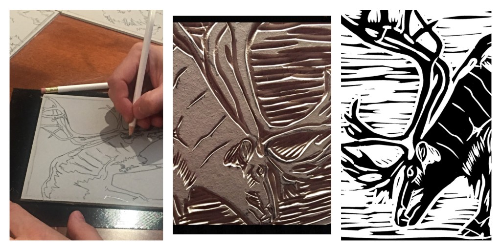
Firstly we needed to decide on a theme and easily settled on Wildlife of Canada. An ideal fit for us, building on our popular line of Canadiana greeting cards. Then we choose the animals and started production. We’ve been thinking about introducing more original lino-cut illustrations into our products, and this turned out to be the perfect opportunity.

caribou collage

2,280 passes through the press and we’re thrilled with the outcome. Each one is signed and an edition of 55. We designed it to give you the option of trimming your favourite image and framing it. If you’re interested in ordering one, you can shop here. And if you do buy it and frame an image, we’d love if you sent us a picture.

three image collage

Posted on Leave a comment

WHY LETTERPRESS – IT’S A DEAD ART, ISN’T IT?

Over the years, we’ve been asked by friends and customers – why letterpress? The next question they usually ask is, can you make money in it?

Well the truth is, for us, it’s a labour of love… literally. There is a ton of work that goes into this, and yes a lot of investment of money and time. One Vandercook SP15 can be anywhere from $3K to $8k+. So before you commit to something like that, you’d better be sure you really love it. Many print shops do make money, they tend to be trade shops that will print, and can print, just about anything – beautiful work. We’re not a trade shop so we pick projects that inspire us and allow us to get better at the craft.

In the Letterpress community, there are artists who illustrate books by carving wood and creating some of the most beautiful books we’ve ever seen. This is a skill I hope to learn and maybe someday master, for now I’ll stick with linocuts. There are typesetters who know how to hand-set pages and pages of metal type, and make it seem so easy. They use letters and words to create wonderful examples of text as the image. And until you have held one of these books in your hands, you will never understand why some people hate the e-reader. The community is filled with oldtimers and upstarts all sharing ideas and knowledge, and we’ve had the fortune of meeting some great and generous people at shows like Grimsby Wayzgoose and OCADU Book Arts Fair making some good friendships along the way.

Then there are people like us, a graphic designer and an advertising account person, who love the entire world of letterpress. As a designer I bring my own flavour to letterpress. I do love the printing process – ink is in my blood now, and under my nails! I love discovering different papers; I love tinkering and maintaining our press, and I equally love the design process. The use of the MAC married with polymer plates has allowed me to do things I couldn’t to do with metal and wood type alone. This community is now what is left between the past and the future. If print dies, then on that day I will be very sad. But, I know in my heart it will never really die as long as we and others like us continue to tinker and toil, cut and set, press and roll all of the amazing things  we all print. No matter what style, what paper, which font, or language – it’s all good.

We love the past and merging it with the present. Whatever the digital world has in store, it will never have the tactile feel of print. A touch screen is cool, but there is still something getting in the way. Sure a virtual world can have benefits, but sometimes you need to get your hands dirty. Even as we are all more and more plugged in, we seem to be missing the boat – technology is a wonderful tool, a tool to be used and controlled, not the other way around. Rather than connect us, in a lot of cases it has separated us. We can live behind the screen and never venture out into the real world.

The photo below is a “Mutiny on the Bounty” movie poster plate. It’s 50 years old and can still be printed. It was made in a time when things were still made solid. Just imagine, making something with your own two hands. A print – being able to see, touch and actually feel something real.

And that is why we love letterpress. It’s not dead yet.


MutinyBounty-Poster-full


Posted on Leave a comment

PABLO THE DOG

Over the last month we helped Pablo the Dog rebrand themselves. Their story is touching and you can learn more about them on their site. We liked what they were doing and agreed to work with them because of their alignment with some of our core values – quality, integrity and care. They are dedicated to improving the way dogs are fed by preparing the treats with fresh, good quality ingredients. And it seems like a nice fit with how we try to live and work, even though we don’t have dogs. (Before we took on the project, cleared it with our two cats, Emma and Pica.) This is a great locally made product and what goes into them is more than just good ingredients, it’s the care and craft they put into every one of their Mutt Balls.

After talking with the client and seeing that she was the illustrator (using her beloved pet as the model) we didn’t suggest a whole new logo and re-branding. The idea was there, it just needed a little push to become more modern, clean, impactful and refreshed. The main focus is still Pablo, and by taking what was already there we were able to refine the typography, colour palette, placement and basic logo structure the brand now has a more professional image and a better first impression for new clients. And both the client and ourselves are happy with the updated look and feel.

In addition to the new logo, we launched the a new WordPress based website for them. Now the client will be able to update the site themselves easily. And we’ll always be there to help with any of the heavy lifting. Check them out: Pablo the Dog

BeforeandAfter


Posted on Leave a comment

OUR PLACE PEEL

Every once in a while we get asked to provide print-only services. It’s not often we say yes because we miss out on the other fun part of the equation: design.

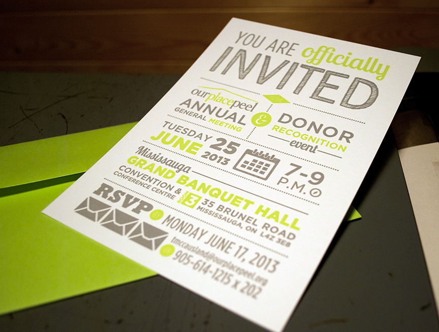
We were approached by the ladies at Patch Design to print a charity event invite for their client Our Place Peel  – a Youth Charity in Brampton. Great cause, brightly coloured and a simple design all made this an easy project to say yes to.

Hope the event is a great success!

PRINT SPECS: Standard 5″ x 7″ / 2 colour / printed on Mohawk Strathmore 110# Bright White Wove. Bright lime green envelopes were from Clear Bags Canada.

DSC_3367

Posted on Leave a comment

STORYSHARE

We haven’t posted in a while so here’s a quick one, with more to follow in the next few days… promise.

In the world of social media it always amazes us how connections get made and things can happen so quickly (contrary to the “slow” process of letterpress). Through the Twitter-verse, we met Kevin September who wanted unique hand-crafted businesses cards for a trip to a Los Angeles media conference. After a little e-chatting, we met over coffee at our local Starbucks and had a great conversation about the arts in Oakville, design, advertising, letterpress – eventually we got to the business card brief. What we find amazing is how many internet professionals we encounter who want printed business cards or wedding invitations. In the world of pixels, designers and art directors rarely get to actually make anything physical anymore. So we love when people in that world still appreciate the finer details of letterpress printing.

We designed these cards for Kevin who is truly a real Storyteller. Hopefully his trip will be a little more fruitful with these in hand.

PRINT SPECS: Standard 3.5″ x 2″ / one-over-one colour / printed on Mohawk Strathmore 110# Bright White Wove (plus we duplexed the cards to make them an extra thick 220#)

DSC_3364

Posted on Leave a comment

WHAT DID YOU SAY?

Is your family like ours? Every time you gather for a special event, the same stories about your childhood get told and re-told. Usually the stories are about a funny and slightly embarrassing thing you did or said. You take turns telling the story, everyone has a good laugh and it’s fun to share the stories with younger generations (are we that old that there are generations after us?)

My family always gets together on December 27 to celebrate my dad’s birthday. This year I decided to immortalize my siblings by printing each one of their “famous” quotes and making them share their own story with the crowd. Lots of fun for them and lots of fun for me setting the words in a meaningful way. I think our future gatherings will be a lot quieter with everyone worried about what they say and whether or not it will be set in print! -MC

DSC_3260 DSC_3251

DSC_3261

Posted on Leave a comment

2013 WOOD TYPE CALENDAR

If the Mayan’s were wrong then you’ll need a great hand-made calendar to find your way through 2013. This 4.25 x 4.25 hanging calendar is small enough to fit anywhere. Great office or kitchen calendar for those font-heads out there.

This is only the second calendar we have ever done. This version has a swanky wood veneer cover with a blind debossed 2013. And each month is letterpressed with a wood type initial and our metal calendar lockup. Printed and made in a very limited quantity of only 8 (yes 8) on Neenah Classic Crest recycled natural white 100 lb. card. Order now

DSC_3248

DSC_3249photo2photo1